Evolve, don’t change

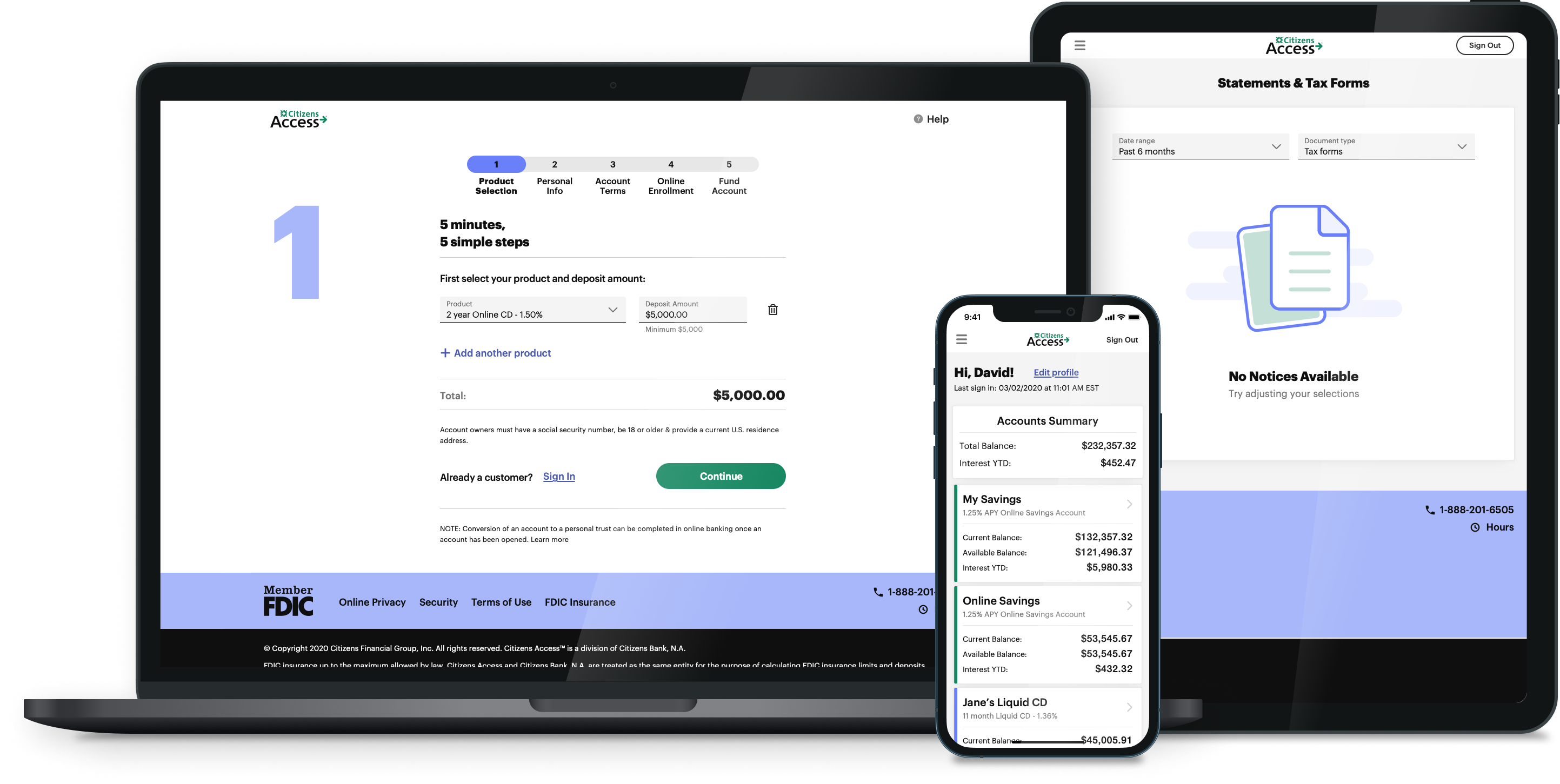
Strategic execution of a modern design evolution



discovery
Legacy Experience
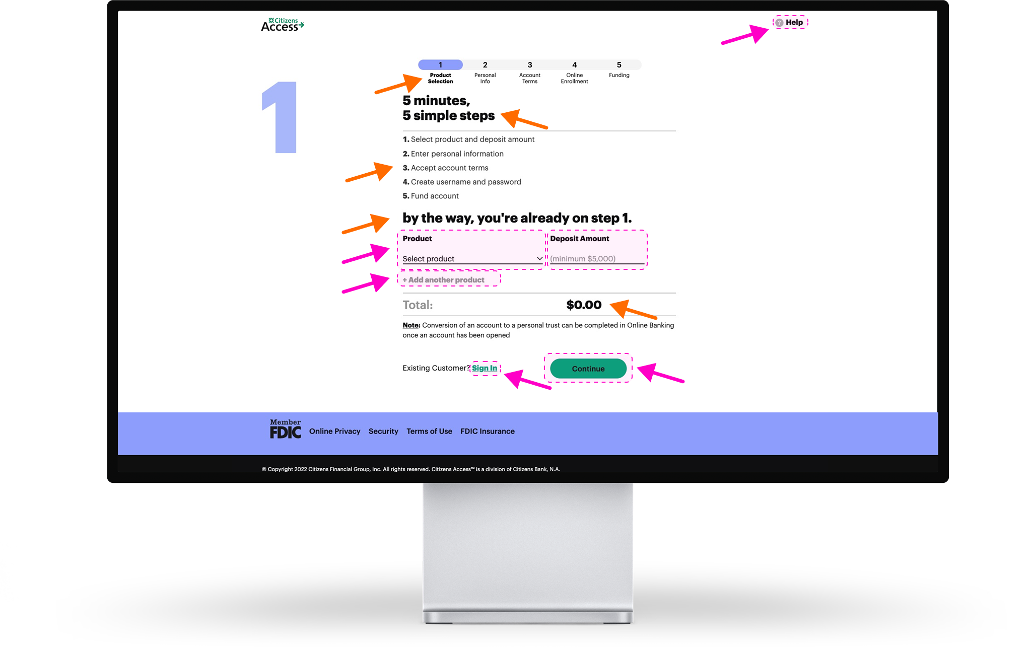
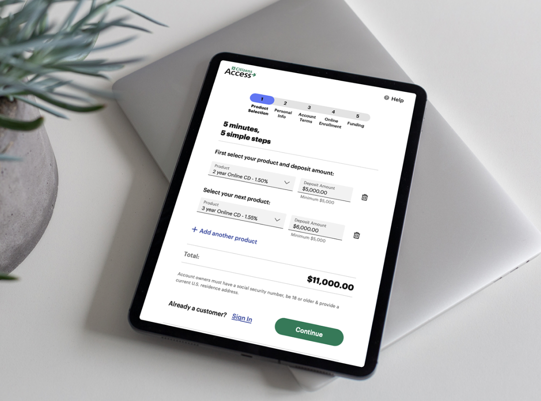
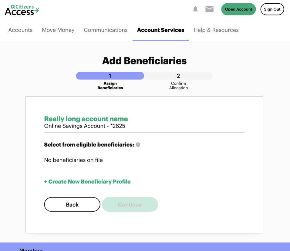
I intentionally try to assess an existing experience as early as possible, allowing me to form an objective unbiased lay of the land. We kicked off our work by performing a baseline heuristic analysis, an approach was based on Nielsen’s interface design heuristic guidelines. This would allow us to identify areas of high-risk to the experience, yielding a design strategy that supports the business’ rapid delivery objectives, while mitigating downstream risk. Additionally, I wanted to pinpoint key journeys to test with users later on as we dug into the authenticated experience.
We also worked closely CX to collect VOC customer feedback. A growing problem with customer service calls was discovered, pointing to larger issues with site usability.
The CAX UX team consisted of myself and 1 researcher at the time, so we decided to narrow our focus on Storefront and Online Account Opening.

Voice of the Customer
Months of Data
Engagements
Pain Points
Primary Pain Points
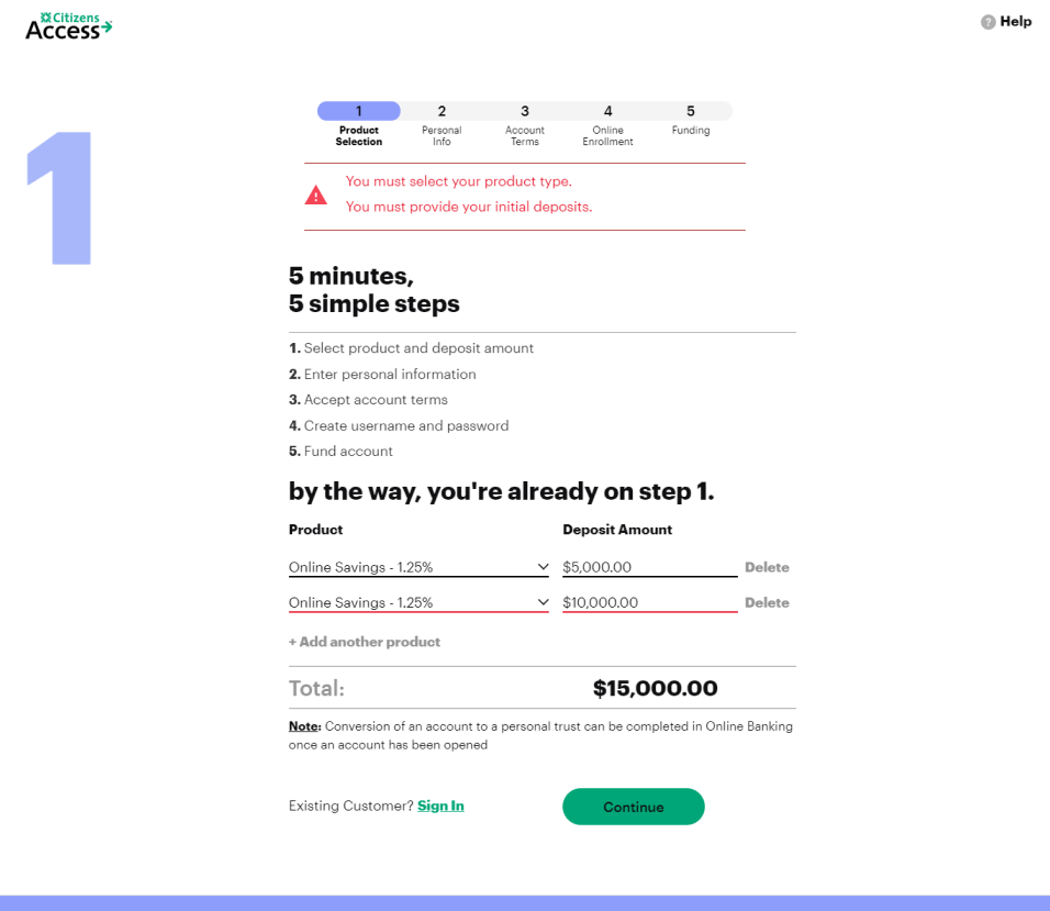
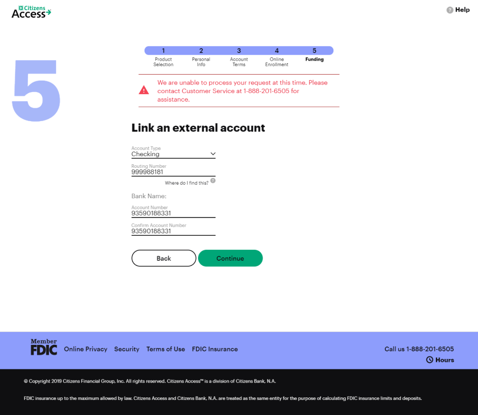
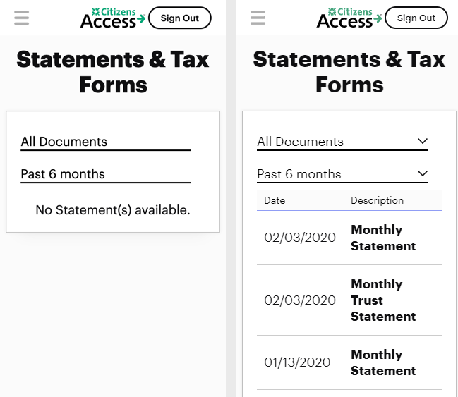
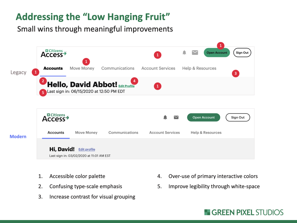
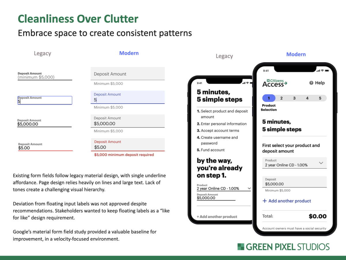
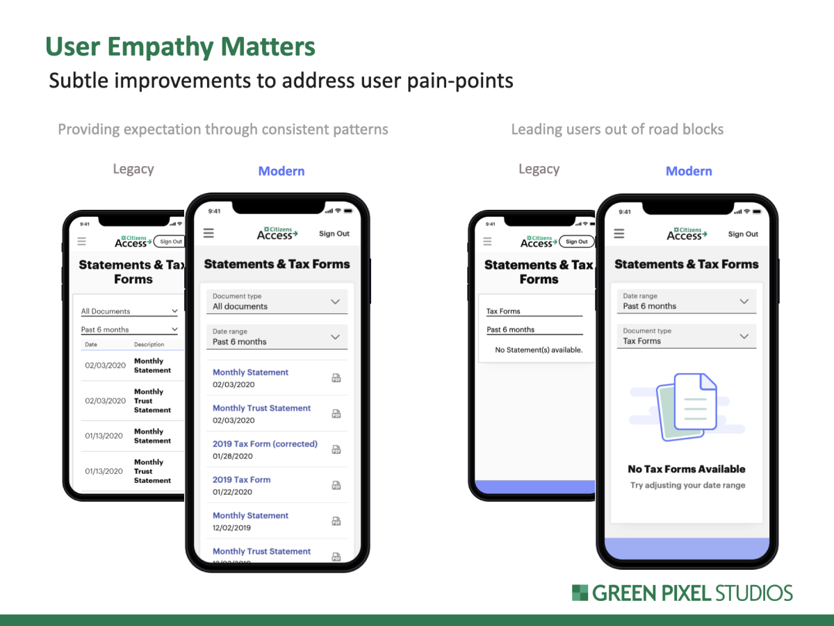
The main themes derived from VOC data were mainly focused around system feedback and inability to advance due to errors. Through this feedback, we were led down a path that uncovered numerous interface design problems. We discovered inconsistencies with system feedback, information overload, and unclear interactive elements. It became apparent that the experience suffered from lack of design and front-end development standards, creating friction for onboarding customers. These challenges also continued throughout the journey into the authenticated “Self Service” experience.
Foundation
Design System
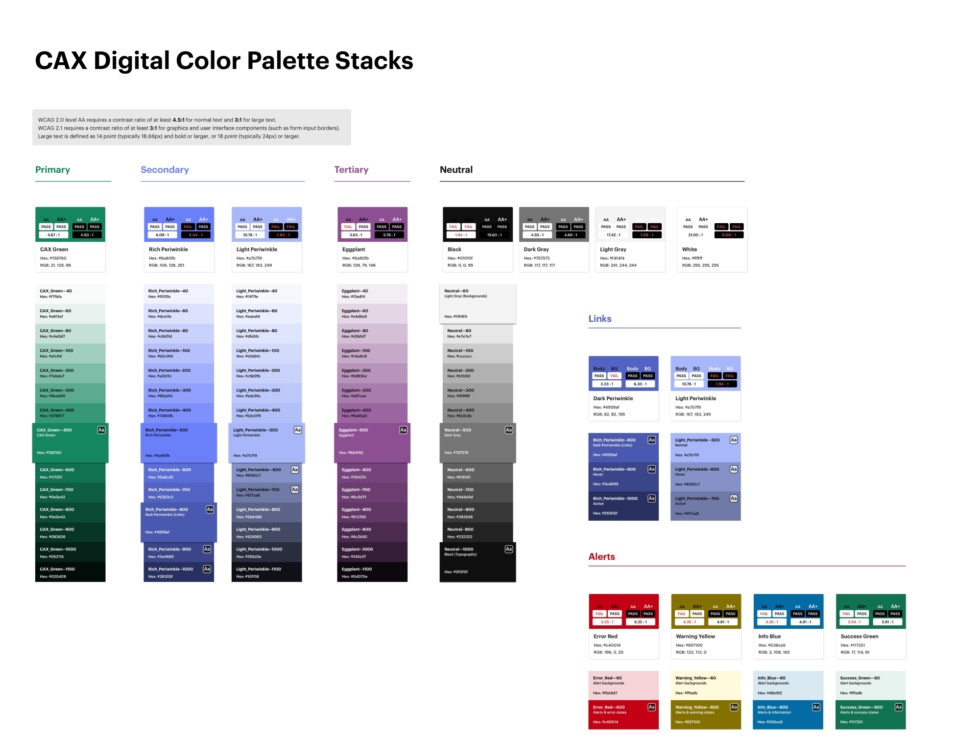
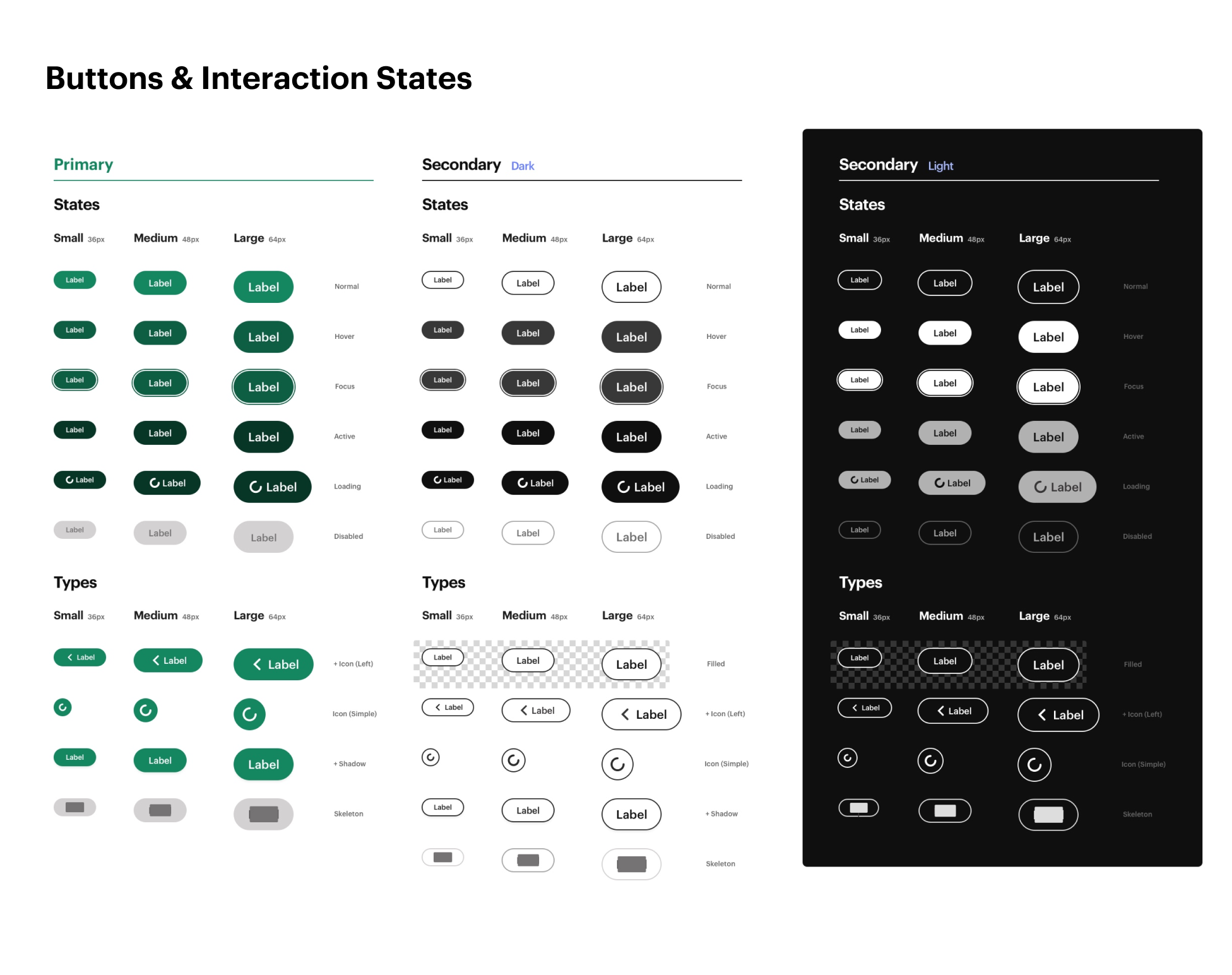
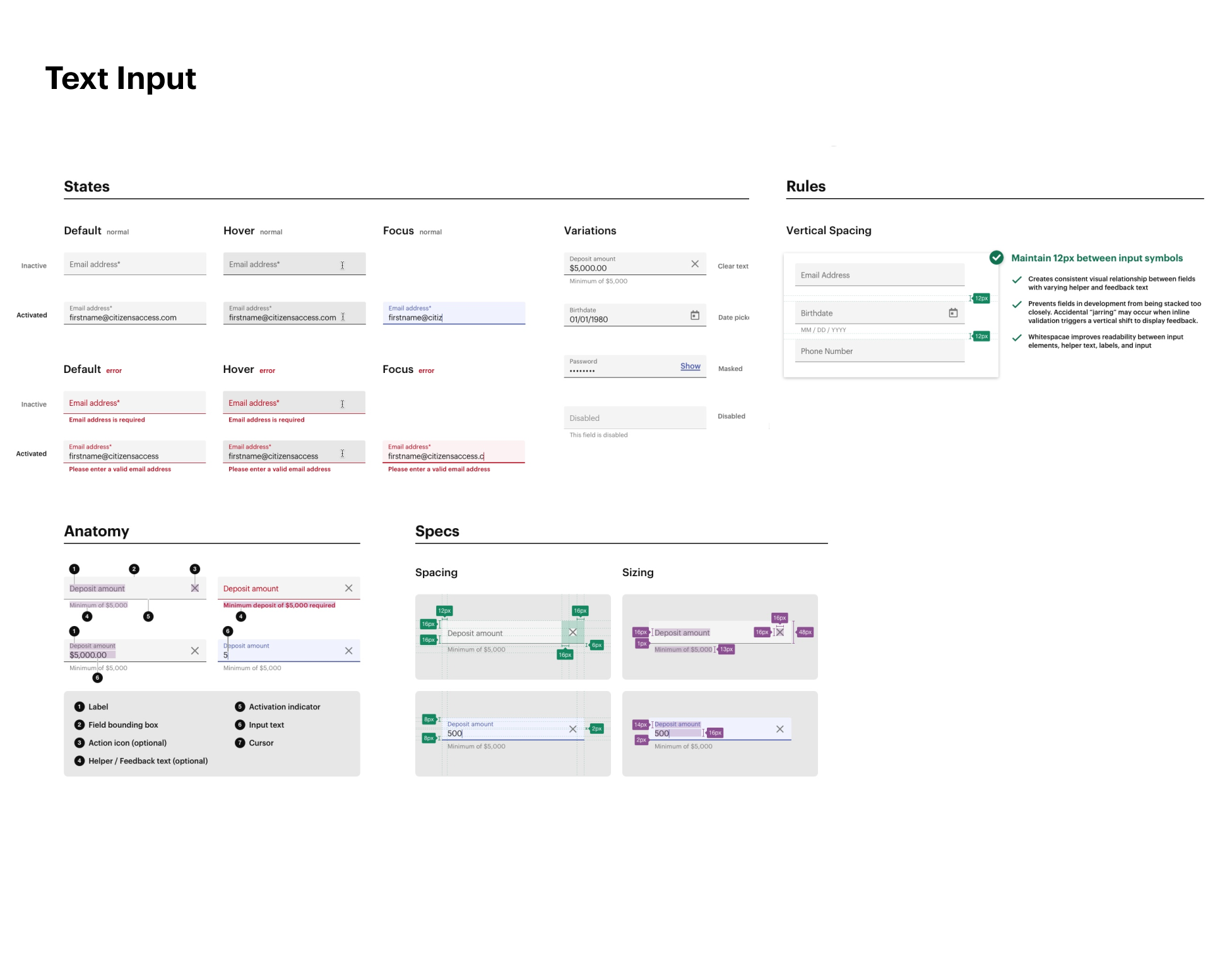
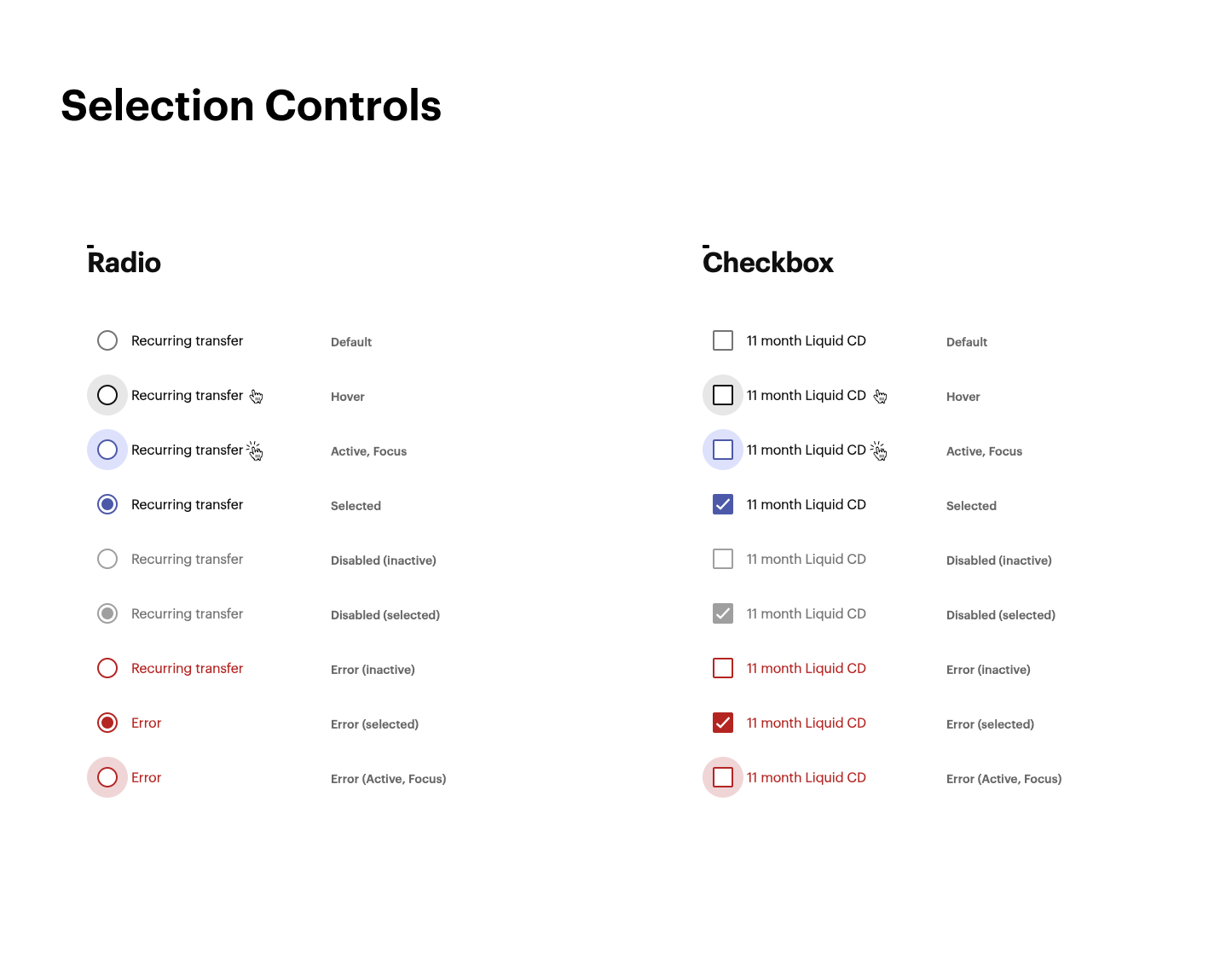
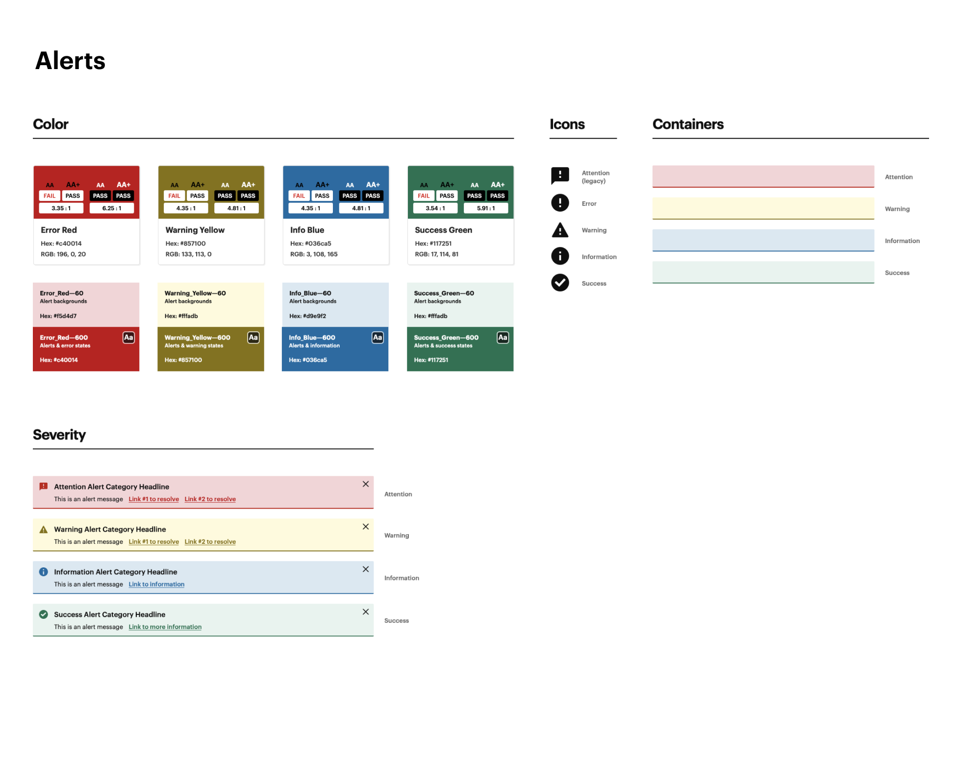
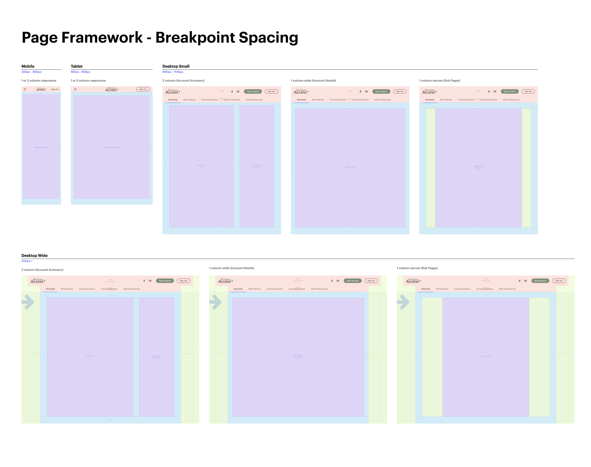
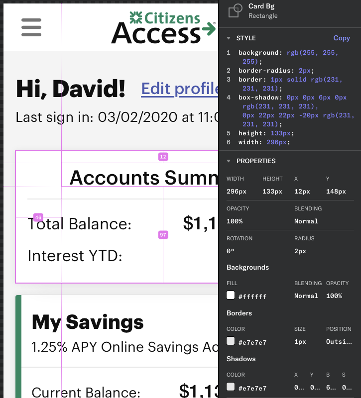
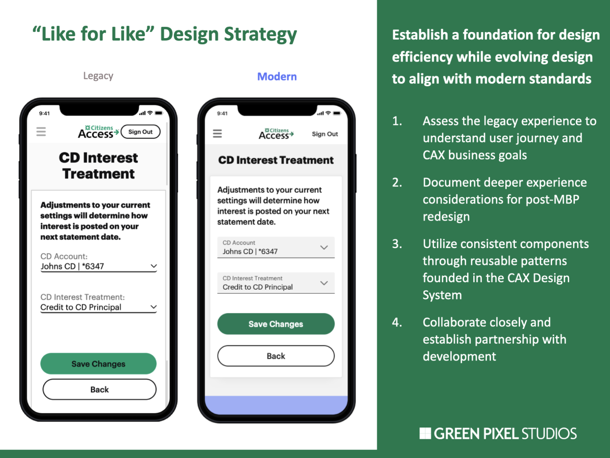
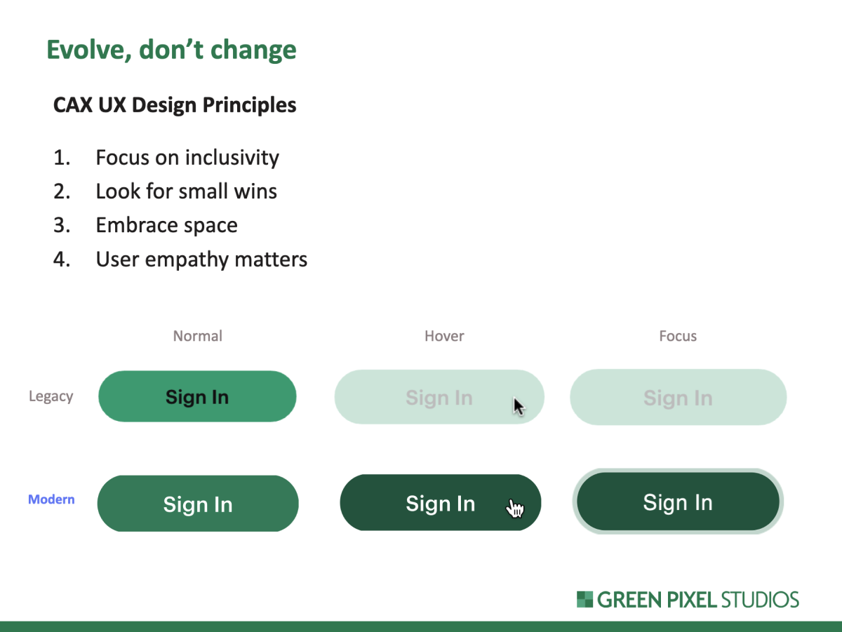
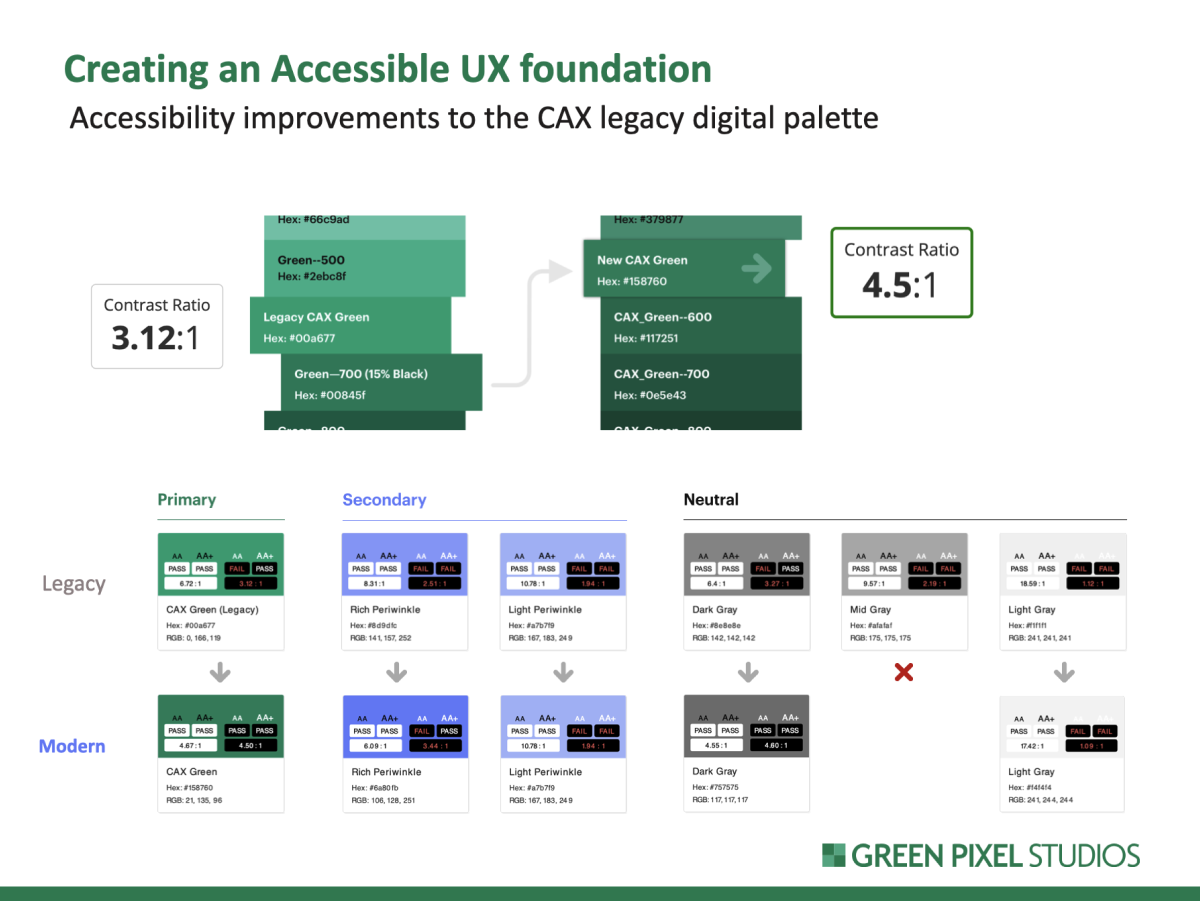
With a clear understanding of experience pain-points, I spent the next 8 weeks designing the Citizens Access Design System (CADS) from foundations through patterns into templates. Since we did not have any legacy design specs to work from, the system was created by backing legacy design into our new design principles. I then establish foundations based on our evolved digital color palette. Construction of components yielded patterns with a clarified interaction model, relaxed element groupings, and a more consistent visual language.
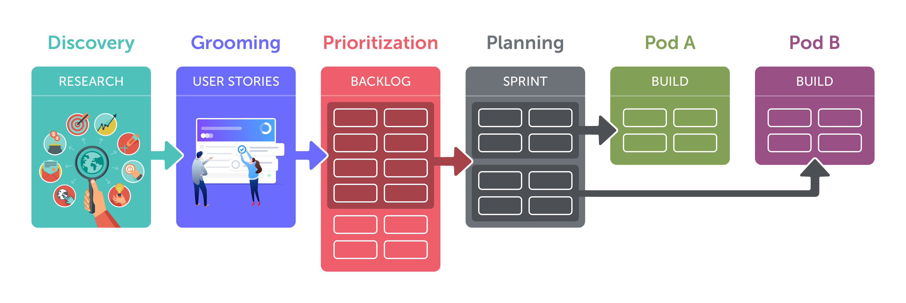
Most importantly, the design system supported a hyper-efficient front end development effort that relied on reusable patterns and templates. Of all the efforts on this project, the construction, growth, and maintenance of CADS was noted to be the biggest efficiency driver. As my new designers were hired during production, it was clear that the design system supported their ability to pick-up and execute design efforts rapidly. I ensured that all design system documentation was extensive and detailed to foster autonomy with developers and designers.
