CVS Retail Shopping Cart
Improvement through Rapid Iteration
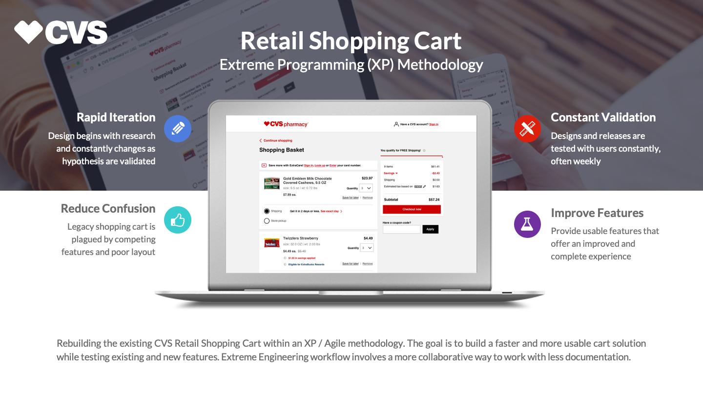
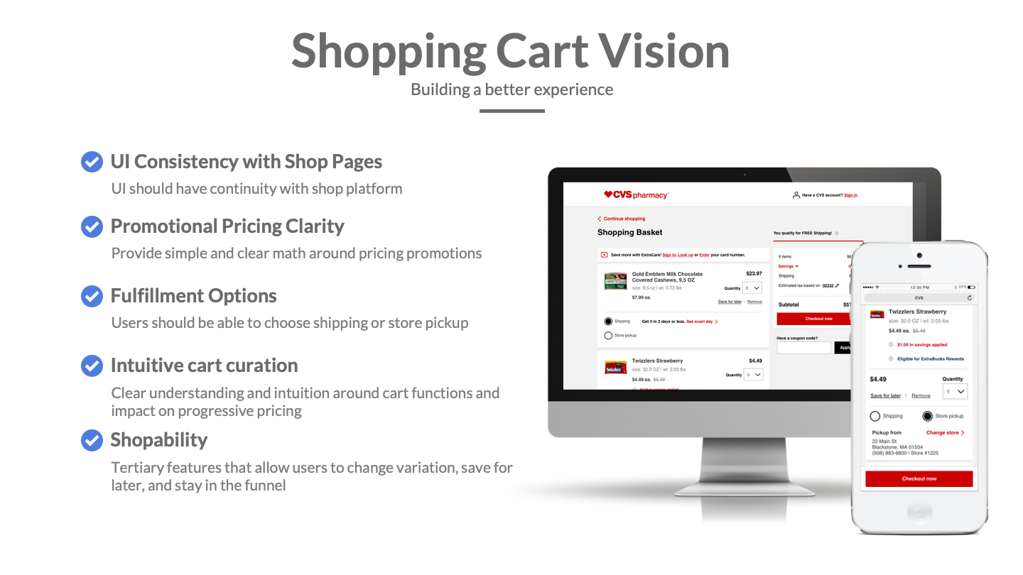
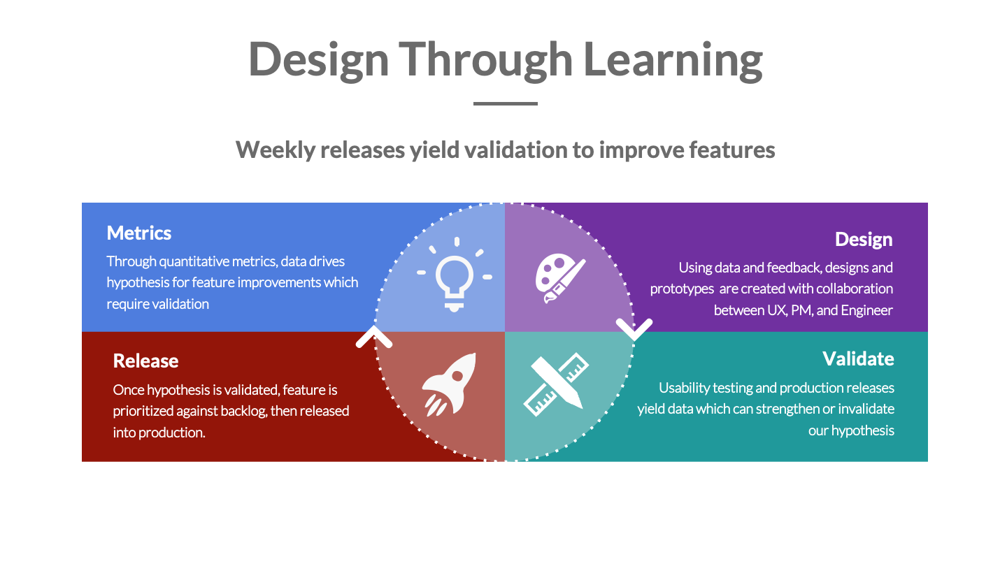
CVS Storefront had become a significant revenue generator in the late 2010’s, highlighting the need for an improved shopping UX. The shift towards online shopping has emphasized the need for robust and user-friendly e-commerce platforms. CVS aimed to revamp its shopping cart UX to improve promotion clarity, increase conversion rates, and improve customer satisfaction. To this end, there was a pivot to pilot the Agile XP methodology to ensure iterative development, close collaboration, and efficient project management.
Role
As UX Design lead, I led iterative design sprints which typically lasted one week. During these sprints, I collaborated closely with a PM, paired designer and developers to gather data and quickly iterate from low into high fidelity.
My Approach
Throughout the design process, the we facilitated regular user testing sessions to gather feedback on the evolving shopping cart design. Usability tests, interviews, and user surveys were conducted to understand user preferences, identify pain points, and validate design decisions. User feedback was treated as a valuable input, driving iterative design improvements.
We used Sketch and Invision to create low and high fidelity prototypes, allowing us to iterate rapidly, then gather feedback from stakeholders and users. The feedback loop helped the team communicate sprint goals quickly, then align business objectives with user needs.
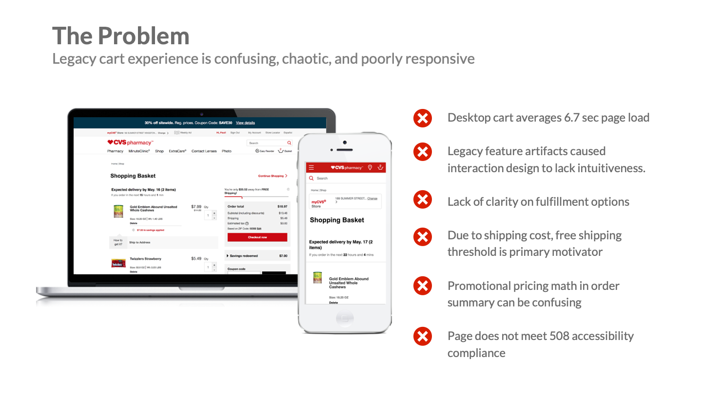
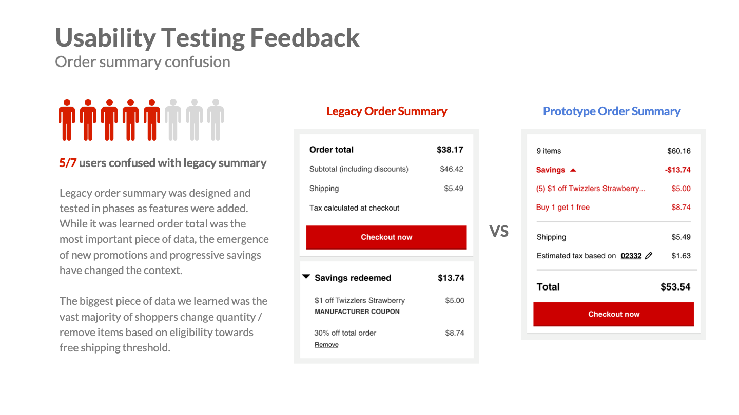
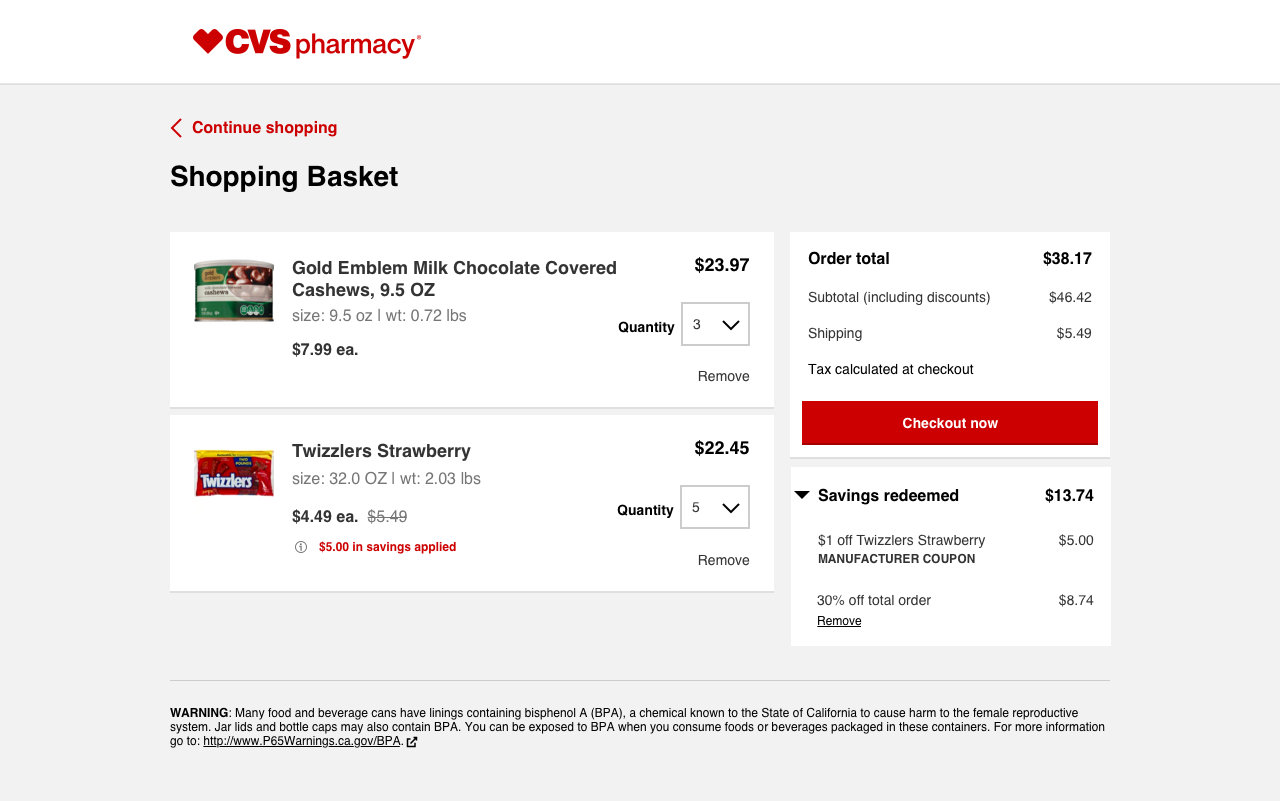
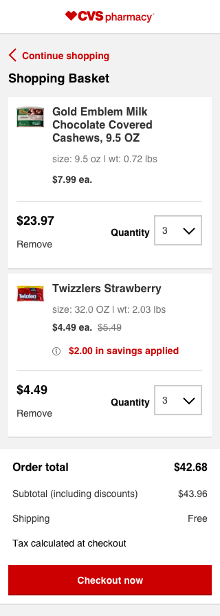
We learned early that the complex nature of the CVS ExtraCare program created heavy confusion around the order summary section. The legacy order summary focused heavily around the progressive savings of ExtraCare. Additionally, the order total was placed at the top of the screen to surface what the previous designers felt was the most important piece of data. This created a learned behavior where shoppers would spend effort to adjust the quantity of items in their cart to achieve the biggest savings that fit a free-shipping threshold. It’s even complicated to explain, let alone use.
From this feedback, we focused design around simplifying the order of savings and promotional items to fit a more natural reading pattern. Items were grouped appropriately, savings line items were placed in correct order, and the total placed back at the bottom. This change yielded a drastic improvement in customer feedback along with a 18% increase in checkout conversion compared to the legacy and order summary.
Overall, Agile XP methodology proved to drive meaningful impact on the business, supporting UX improvements on the CVS Retail Shopping Cart. The methodology fostered increased collaboration, rapid iterations, and improved product quality, resulting in a highly user-centric and efficient shopping cart system.
